Introduction:
Bootstrap is a popular front-end framework used as user interface for websites and other applications. It is initially developed by couple of Twitter employees. It is now an Open-Source project. Today Twitter Bootstrap is the leading web user interface framework. It’s supported by a huge community. It has become popular because of its simplicity and developer friendly nature. We can complete the user interface design with ease.
In this article I’ll give you brief details on Twitter Bootstrap. I’ll be writing more in-depth articles on the features.
History:
- Mid-2010: Created by couple of employees at Twitter.
- August 19, 2011: Released v1.0.0.
- January 31, 2012: Released v2.0.0.
- February, 2012: Become the popular development project in GitHub.
- August 19, 2013: Released v3.0.0.
- November 6, 2013: Released v3.0.2.
Advantages of using Bootstrap:
There are lots of advantages for using Bootstrap as front-end framework in web design. Here are few of them.
- Simple and powerful CSS.
- Easy to implement. There is nothing new to learn. All you have to know is HTML and CSS.
- It saves user interface design time. You can just download a template from the vast collection and do some customization. Within hours you can complete a front-end design for your website.
- Consistency. It gives consistent look and feel in all platforms and browsers.
- Open source. So it’s freeeee!!…
- Popular front-end framework backed by Twitter and supported by a huge community. So getting help is easy.
- Easy to customize.
- Lot of sample templates available.
- Responsive in nature. So no need to do more coding or setup for mobile devices.
- Contactable with all browsers.
- Platform independent. Bootstrap is made up of pure CSS and JavaScript. So you can use bootstrap front-end framework with ASP.NET, Perl, PHP, JSP, ruby… etc.
- It has extensive set of components and plugins like navbar, collapse, accordion, tabs, etc…
- Lot of third-party controls and plugins available online.
Disadvantages of using Bootstrap:
Of course, there are disadvantages as well.
- Bootstrap uses lots of DOM element classes. It does not follow the best practices of website design.
- Your website may look like lot of other websites. Bootstrap is not your option if you are planning to create a unique and distinct web design to stand out from others.
- Lot of useful controls is missing (tree view, drag and drop, editable grid, etc…) in the default library. Of course, you can get them from third-party.
- It’s not backward compatible: You can’t just remove the bootstrap v2 libraries and add v3 libraries to the website for upgrading. If you plan to upgrade, you may need to consider the modified CSS classes thought the website.
Downloading Bootstrap:
You can download the default libraries from http://getbootstrap.com/. Just go to the website and click Download Bootstrap button to download the latest default libraries. 
Bootstrap Files:
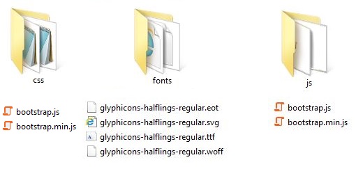
Clicking the download button will download a zip file (bootstrap-3.0.2-dist.zip). The contents of zip file looks like below. There will be three folders css, js and fonts. The css folder has the compiled css files along with the corresponding minified files. The js folder has the compiled js file along with the minified file. 
Customizing:
The default library includes all the components and controls. You may not want all the components for your website. Or you may need to customize the colors and fonts. Bootstrap is providing options for customizing the libraries for your need. You can go to http://getbootstrap.com/customize/ for doing the customization and download the customized libraries. Read more on customizing >>
Dependency:
Bootstrap’s JavaScript plugins require jQuery as dependency. Bootstrap v3.0.2 depends on jQuery v1.9.0 or higher.
Browser Support:
Bootstrap works good in latest browsers like Chrome, Safari, Firefox, Internet Explorer and Opera. There are some limitations in supporting older versions of browsers like IE 9 and older, Safari v6.1 and older.
Template:
The basic template of Bootstrap implemented html file looks like below. It will have the viewport meta tag in the header which decides the responsiveness of the layout. Below the meta tag the bootstrap css style sheet should be linked in the header section. At the bottom, just before closing the body, the jQuery java script and the bootstrap js file needs to be included. bootstrap js file should be included below the jQuery. Read more on Structure and Template>>
<!DOCTYPE html>
<html>
  <head>
    <title>www.MyTecBits.com - Bootstrap</title>
    <meta name="viewport" content="width=device-width, initial-scale=1.0">
    <link href="css/bootstrap.min.css" rel="stylesheet">
    <!--[if lt IE 9]>
	<script src="js/html5shiv.js"></script>
	<script src="js/respond.min.js"></script>
    <![endif]-->
  </head>
  <body>
    <h1>Hello, MyTecBits.com!</h1>
    <script src="js/jquery-1.10.2.min.js"></script>
    <script src="js/bootstrap.min.js"></script>
  </body>
</html>
CSS Styling:
Bootstrap supports most of the fundamental HTML5 DOM elements by default. Below is some briefing on some of the elements. I’ll add more detailed article in future.
- Mobile Support: Form version 3, it takes mobile first approach. So there is no separate style sheet for responsive design or mobile design. You can enable or disable the touch zoom using the viewport meta tag. Images also can be made responsive using the .img-responsive class.
<meta name="viewport" content="width=device-width, initial-scale=1.0, maximum-scale=1.0, user-scalable=no" />
<img class="img-responsive" alt="Responsive image" src="[[[Image Url]]]" />
- Containers: You can use the .container class in a div tag to wrap the contents and center them.
- Grid System: Bootstrap has a fluid grid system. It is responsive in nature. The page layout has to be created using the grid system. It can scales up to a maximum of 12 columns. You can divide the grid to multiple columns using the predefined classes like .col-xs-4, col-md-1, etc.
- Typography: Styles for most of the HTML typographic elements are defined in the style sheet. For example, there are classes from .h1 to .h6 for header tags h1 through h6, .small class for small, etc…
- Tables: There are several table styles below are few of them.
- Basic: Uses .table class. The table will have only horizontal dividers.
- Striped Rows: Uses .table-striped class to display zebra-striping.
- Bordered: Uses .table-bordered class to display borders around the table the cells.
- Hover rows: Uses .table-hover to display a hover effect on the rows.
- Condensed: Uses .table-condensed class to make the table more compact.
- Responsive tables: Wrap the table having .table class with a div tag having .table-responsive class to create a horizontal scroll when the screen size goes below 768px.
- Forms: There are three form element class types
- Basic: By default the form elements like input, textarea and select elements with the class .form-control are set for 100% width.
- Inline: Uses .form-inline class in form tag for compact inline form controls.
- Horizontal: Uses .form-horizontal class to align groups of controls defined by .form-group class to align horizontally.
- Buttons: You can do various styles in buttons including coloring, changing size, rounding the edges, disabling, etc…
- Images: Images can be styled to circle, rounded edges and thumbnails.
Components:
There are several predefined components available in the bootstrap library by default. Below are some of them. I’ll write about them in details in separate articles.
- Glyphicons: There are 200 glyps. The glyps are in font format.
- Dropdowns: Can make a list of links to drop down from the menu interactively.
- Button groups: Multiple buttons can be grouped together horizontally or vertically using the .btn-group class.
- Input groups: Form text element can be appended by adding text or button using the .input-group and .input-group-addon class.
- Navbar: Provides the responsive navigation bar for the website.
- Breadcrumbs
- Pagination.
- Labels: Labels are available in different shades and size.
- Badges: Can be used to highlight new/unread items.
- Progress bars.
- Media object: Can be used to display media at the left or right and description about the media in its side.
JavaScript Plugins:
The downloaded default bootstrap java script file (bootstrap.js and bootstrap.min.js) has all the plugins. You don’t need to add any more file to get the bootstrap’s JavaScript plugins. Bootstrap’s JavaScript plugins include:
- Transitions: To achieve transition effects.
- Modals: For dialog prompts.
- Dropdown: For drop down menu.
- ScrollSpy: Used to automatically indicate the navigation targets while scrolling the content.
- Tab.
- Tooltip.
- Alert: Used for dismissing the alerts.
- Collapse: used for collapsible components like navigation.
- Carousel.
- Affix: Used for sub-navigation.
Competitors:
Just like Twitter Bootstrap, there are several other front-end frameworks. The notable once are Zurb Foundation and jQuery.UI. Read more about competitors >>
Reference: getbootstrap.com
